Saturday, October 10, 2009
Ten-Ten Oh-Nine
Don't forget to stay tuned to my posts at Greater Greater Washington.
I've got a few posts in the works, but for now I'm starting a new feature, "Picture of the Day". Now that I've got a Flickr account, I'm slowly uploading my pictures of transit, urbanity, and more. I hope you enjoy this feature. Thanks for reading!
Thursday, September 10, 2009
Recently Absent
I've been absent from Track Twenty-Nine lately, mainly because I've been writing for Greater Greater Washington.
In case you haven't seen them, I've had two recent series there.
Metro Motifs
Washington's Rails (ongoing)
- Part I: The Network
- Part II: CSX Plans 'National Gateway' for Freight
- Part III: Maryland's Wish List
- Part IV: The Long Way 'Round
- Part V: Unbottl(neck)ing Baltimore (forthcoming)
Monday, August 24, 2009
Like a Bad Horror Movie
I had (and still have) high hopes for Obama, but as yet, nothing's doing. I'm afraid if the Democrats don't get their butts in gear, the party will not stand in the next election. All parties are fragmented to one degree or another, but the Republicans always toe the party line. Democrats are wasting great opportunities to further progressivism, and Obama seems unable to get them to unify behind good policy. I don't want to think about what will happen if Republicans gain seats during the mid-term elections in 2010 - it would be a huge setback for cities, rail, healthcare, and gay rights.
Yonah Freemark over at the Transport Politic links Louisana's Bobby Jindal to this zombie phenomenon in regards to his flip-flopping over high-speed rail between New Orleans and Baton Rouge.
Sunday, August 23, 2009
Track Twenty-Nine: Two Years Old
I'm afraid that my second year did not see me achieve my goal of three posts a week, but I feel my content is worth reading and informative. Hopefully, I'll do a better job in my third year of increasing both the quantity and quality of my musings.
A look back on the last year is in order, I suppose.
During my second year in Washington and my second year as a blogger, I've increased the sphere of my writing. I now write a weekly feature for The New Gay, called Newsprints, and a biweekly column for the same publication, known as Dispatches from Left Field. In addition, I've started writing for Greater Greater Washington, with much of that content crossposted here.
In terms of my Washington explorations, my travels on the Metro have added a few stations from last year, but no new territory. I've still never ridden the Red Line north of Rockville or the Green Line south of Southern Avenue. But I've used (entered or exited the faregates) quite a few stations. I only lack two in Montgomery County and four in the District of Columbia. Prince George's County and Virginia are a bit more daunting, but I'm sure I'll get up to 100% one of these days. At the moment, I'm at 68 out of 86, so my batting average is 79%.

Another goal of mine is to ride every rail transit system in America. I'm always gaining and losing ground (because they keep opening new systems). In the last year, I've added a few:
San Jose LRT,
ACE,
Sacramento LRT,Minneapolis' Hiawatha Line - which I did not get any pictures of,
The Long Island Railroad - which I did not get a picture of, and
AirTrain JFK - which I also have not photographed.
I suppose the largest development in the past year was my graduation from graduate school at the University of Maryland. Now, I'm officially an Urban Planner. I've also moved in with my boyfriend of two years, which has been great.
Wednesday, August 19, 2009
This Bud's for You
Sunday, August 16, 2009
Major Metro Service Disruptions Through August
There are two major track work projects ongoing throughout August. One is the rehabilitation of the Blue and Yellow Lines between Pentagon City and National Airport. This project will cause major service disruptions every evening Sunday through Thursday after 10PM. Normal service will be in place on Friday and Saturdays. Track circuit replacement on the Red Line will cause single-tracking between Brookland and Takoma.

Blue Line
After 10PM, Blue Line trains will operate in two segments: between Franconia-Springfield and King Street and between Rosslyn and Largo. There will be no Blue Line service between King Street and Rosslyn. Arlington Cemetery Station will be closed at 10PM, as normal for summer. Shuttle buses will provide service between Rosslyn and Pentagon.
Yellow Line
Trains on the Yellow Line will operate only every 36 minutes between Huntington and Fort Totten.
Red Line
Due to replacement of the track circuit involved in the June 22 crash, Red Line trains will share the same track between Takoma and Brookland after 10PM every day of the week throughout August. Additionally on the weekends of August 14-16 and August 21-23, there will be NO RAIL SERVICE between Takoma and Brookland on the Red Line. Shuttle bus service will connect riders between Brookland, Fort Totten, and Takoma. Green and Yellow Line services at Fort Totten are unaffected.
Friday, August 14, 2009
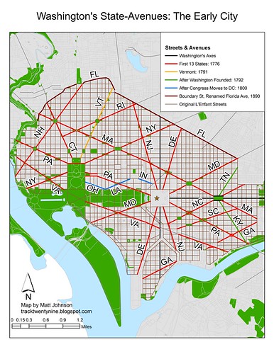
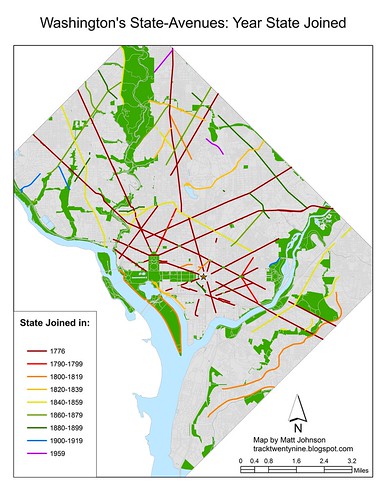
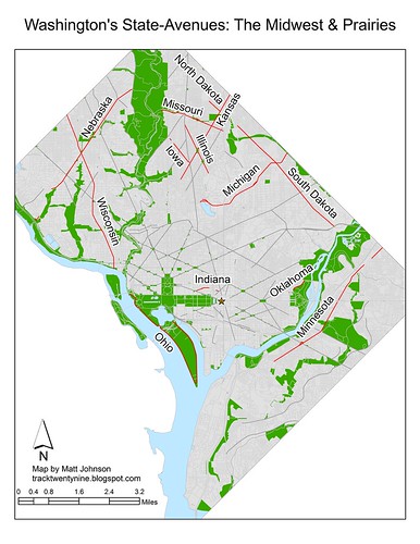
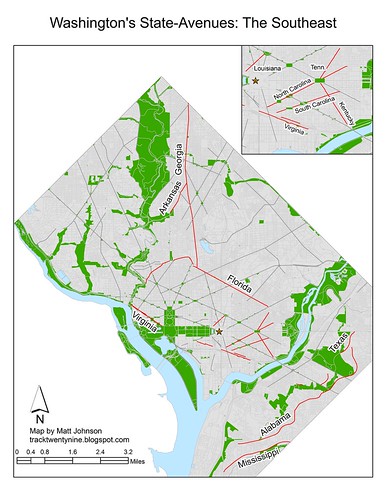
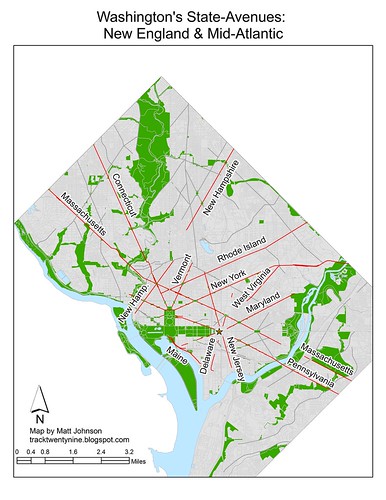
Washington's State-Named Avenues
Crossposted at Greater Greater Washington
Last week, I wrote about the system of street naming in Washington. From A Street to Verbena Street and from Half to Sixty-Third, our lettered and numbered streets make it difficult to get lost with their logical progressions.
But our transverse diagonal avenues confound everyone from tourists to suburban motorists. Not only do they break all the grid rules, they even manage to break up the grid itself in many places, like H Street, NW at New York Avenue. And to make matters worse, they often skip across parks, rivers, even entire neighborhoods, before starting up again, sometimes even on a different heading.
Locals have mostly figured out where the avenues are, at least the major ones. Maryland residents use many of these broad streets as their connections to downtown, but a short street like North Dakota Avenue goes unnoticed by almost everyone outside the immediate neighborhood.
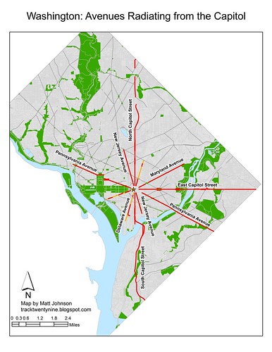
As I noted before, the plan of the city was meant to reflect the structure of the government. For that reason, the city's quadrants are centered on the Capitol Rotunda. The state-named avenues are no exception. Being the major streets of the city, L'Enfant's plan placed many of them so that they emanated from certain points. In this regard, they provided long unobstructed views toward the icons of our nascent government.
From the White House, Sixteenth Street forms the major axis. In fact, Thomas Jefferson intended it to become the Prime Meridian, which is where Meridian Hill Park gets its name. Moving clockwise, one encounters Vermont Avenue, New York Avenue, Pennsylvania Avenue, New York Avenue, Pennsylvania Avenue, and Connecticut Avenue.
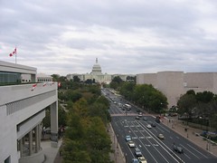
The grand avenue, home to everything from Inaugural Parades to festivals of all sorts, is Pennsylvania Avenue. Connecting the Legislative and Executive branches, it was always meant to be the heart of Washington. In the southeast, it continues as a major roadway toward central Prince George's County, Maryland.
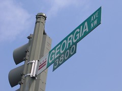
Similarly, Connecticut, Georgia, and New York all are major thoroughfares to outlying parts of the region. Another important street is Wisconsin Avenue, running from M Street in Georgetown to the Beltway north of Bethesda; it was an important road long before the name was applied. As late as 1903, it was still called the Georgetown and Rockville Pike. This historic name is the basis for two streets in suburban Montgomery County: Old Georgetown Road and Rockville Pike, the straightened version.
But street-naming doesn't have anything to do with importance to the Revolution or the prestige of any one state; at least not directly. State names were assigned to avenues based on their geographic location within the United States.
For that reason, one found Georgia Avenue in the southernmost portion of the city. Running from what is now Fort McNair across the southern side of Capitol Hill, we know it today as Potomac Avenue. Near the northern edge of the city, the avenue named after the northernmost state, New Hampshire, passed through Washington and Dupont Circles, just as it does today.
By the time Congress first met here in 1800, there were three diagonal avenues left to be named. Ohio and Indiana fit into the system well enough, but Louisiana was sorely out of place.
With the first nineteen states represented in the city, Washington ran out of avenues. Maps from the 1800s available on the Library of Congress' website show that Maine and Missouri had short avenues within the bounds of the Mall, but it is unclear exactly how all the new states were represented as they came on board.
In 1890, Boundary Street was renamed after the twenty-seventh state, Florida. Despite being further south than any other state (it would remain so until 1959), it got the street forming the northern boundary of the city.
Yet by the time the twentieth century got going, Washington was expanding into the hills and dales above the Fall Line. As the street grid expanded, new avenues were added, and old ones obliterated. Around 1914, the citizens of Brightwood managed to get Brightwood Avenue renamed after Georgia. They had hoped to curry favor with senator Augustus Bacon, but he promptly died, and never had a chance to affect the fortunes of these suburban pioneers. The construction of the Federal Triangle complex in the 1930s eliminated Ohio's avenue and shortened what had been Louisiana Avenue. Louisiana's name itself had moved a few blocks east to a new street constructed as part of the changes brought by Union Station and Columbus Circle in 1907.
Monday, August 10, 2009
Passenger Flow for Individual Metro Station
In late July, I wrote about passenger flows on the Metro system. Unfortunately, the study had to cope with limitations in the data from Metro. Better data would certainly yield more informative results, we can perhaps glean some more information from the existing data. Some readers asked about breaking down the data to create flow maps for individual stations.
To estimate the ridership on each link of the Metro system, we assigned trips from each origin/destination station pair to a given route based on a survey. While the survey was unscientific, it did give us insight into how Metro riders choose their routes within the system. If we look at a given station, according to Metro's data, we can tell how many passengers are traveling to any other given station. Our model assigns those trips to certain links based on a decision tree created from the survey results. A look at this data won't tell us when the majority of riders are boarding at a given station, but it does tell us where they're going.
Take, for example, Vienna. Based on what we know about the station, it is safe to assume that most riders are boarding in the morning and traveling toward downtown. While it is clear that some of the boardings at Vienna do take place during off-peak periods and in the evening rush, with the data we have, we can't say how many.
The above map shows the passenger flow of boardings at Vienna. Most riders are going to downtown. The majority of passengers have exited by the time their train reaches L'Enfant Plaza. Few transfer to other lines.
A look at the other end of the Orange Line shows a similar trend. In this case, passengers boarding at New Carrollton have mostly alighted by the time their train gets to Farragut West. Only a few continue farther west. Similarly, not very many transfer to other lines.
Looking at a station closer to the core, we can see that at Ballston, which has a healthy mix of offices and residential, mostly sees trips toward downtown. Remember that we can't tell when these trips are occurring, but this seems to indicate that people are either commuting from Ballston to downtown (AM) and back (PM) or from downtown to Ballston (AM) and back (PM). It seems more likely that the majority are downtown-bound in the AM. Some trips do head toward Vienna. The links west of Ballston either show people from the suburbs riding from Vienna to Ballston and back (their PM trip being captured here) or Ballstonians commuting to Vienna (AM captured here) and back, although it's actually a combination of both directions of travel.
A look at a similar activity center on the Red Line, Bethesda, shows similar results. Most trips whose origin is at Bethesda are headed for downtown. Some passengers do head toward Shady Grove, however. But as before, we cannot be certain of the time of day when these trips are occurring, and therefore cannot tell for certain which the predominant direction of travel is at a given time.
A little farther down the Red Line at Cleveland Park, it appears that most trips are bound for downtown. Other urban stops of a similar nature probably show similar results.
Looking at the central business district yields some interesting results as well. Unsurprisingly, passengers bound from the Farragut Square area to destinations in Montgomery County tend to board at Farragut North while passengers bound for Virginia enter the system at Farragut West. Not as many Farragut West customers are headed toward New Carrollton and Largo as Virginia, but there is some travel to the east. Perhaps the most notable piece of information to be gleaned from these maps revolves around Green Line-bound passengers. While not many passengers bound toward Greenbelt or Branch Avenue board at either of the Farragut twins, most of those who do board at Farragut North.
For some reason there is a preference for the Red Line for passengers headed toward the Green Line. To some degree this could be a habitual behavior remaining from the period 1993-1999 when Green Line trains from Greenbelt shared with the Red Line between Brookland and Farragut North. More likely, however, patrons probably value the Red Line's higher frequency and shorter trip to the nearest Green Line transfer station (Gallery Place). On the other hand, it could just be that more workers are concentrated at Farragut North and those headed for Orange are willing to walk to Farragut West, but Green Line riders don't see the need.
*NOTE: All maps are to scale. The thickness of the lines on each map is comparable to the thickness of the lines on all the other maps. The thicker the line, the higher the ridership.
Comments have been disabled. Please comment on this same post at Greater Greater Washington.
Friday, August 7, 2009
Washington Streets
Crossposted at Greater Greater Washington Visitors and residents of Washington, DC know, to one degree or another, about the city's street naming conventions. Most tourists know that we have lettered and numbered streets. And to some degree, they know there is a system, but it doesn't stop them asking us directions. But most out-of-towners and even many residents don't understand the full ingenuity of the District's naming system.
Washington is partially a planned city. The area north of the Potomac and Anacostia Rivers and south of Florida Avenue (originally Boundary Street) is known as the L'Enfant City. This area of Washington was the original city of Washington, laid out by Pierre L'Enfant and Andrew Ellicott. It is comprised of a rectilinear grid with a set of transverse diagonal avenues superimposed. Avenues frequently intersect in circles or squares, and the diagonals create many triangular or bow tie-shaped parks.
The axes also provide the basis for the naming and numbering systems. Lettered streets increase alphabetically as they increase in distance both north and south of the Mall and East Capitol Street. Numbered streets increase in number as they increase in distance both east and west of North and South Capitol Streets.
Many street names intersect in multiple quadrants. G Street intersects Sixth Street in all four quadrants, and each of these intersections is separated by over a mile. Western, Eastern, and Southern Avenues form in many places the land boundaries of the District.
As the city expanded, so did the system of naming streets. In the L'Enfant city, the highest lettered street was W Street (running between Ninth and Fifteenth Streets NW). Unlike numbers, the alphabet is not infinitely expandable. In order to continue to have an alphabetical progression of streets, the alphabet starts over. Only "streets" are subject to the convention. Avenues, roads, drives, and other minor streets do not conform to the alphabetical progression. "Places," on the other hand, usually appear one block north of the correspondingly lettered street and often share the same first letter.
After the first alphabet runs out of letters, street names restart alphabetically with two-syllable names. "Adams Street" follows "W Street." Once the second alphabet is exhausted, the system repeats with words of three syllables. "Webster Street" is followed by the third alphabet's "Allison Street." However, the Fourth Alphabet does not use words of four syllables. Instead, the Fourth Alphabet, only present in the Northwest and largest quadrant, uses the names of plants in increasing alphabetical order. Thus "Aspen" follows "Whittier."
Except for California Street and Ohio Drive, all the states have avenues named after them. The shortest of the avenues is Indiana Avenue, found near Judiciary Square and the Archives. It stretches less than half a mile, exclusively in Northwest. While no state-named avenue passes through all four quadrants, the longest, Massachusetts Avenue, passes through three. It stretches from border to border across the District, although it lacks a bridge over the Anacostia, and continues northward into Montgomery County, Maryland.
Urban Thinking
Tuesday, July 28, 2009
Where the Metro Riders Are, and Aren't
How full are Metro’s trains at any point in the system? What routes do riders take when confronted with a choice between two transfers, or between a longer one-seat ride and a transfer? Last year, in discussing I created about the proposed Blue Line reroute, a reader asked about this, but Metro hasn’t collected the data.
To answer this question, classmate and frequent GGW commenter Reza and I created a non-scientific survey, and used the data to build a diagram of passenger traffic on Metro system. This survey was unscientific and the results should not be considered as absolute facts. It does show potential trends, but a larger and broader sample would be necessary to validate these results.

The survey first asked respondents to state a certain preference, like the top factor they use to decide on a route. Later, it presented a specific scenario and asked respondents which route they would choose. Overwhelmingly, survey respondents primarily prioritized getting to their destination in the shortest time. A plurality of 44 percent chose minimizing transfers as the second most important factor. For the third choice, a plurality of 37% said, given the option, they’d choose a line with more frequent trains.
Based on the responses, Reza and I created a decision tree to assign the trips from the 2007 Ridership Survey to the links of the Metro system. On the segments of the system without alternative routes, the diagram is 100% accurate from Metro’s origin and destination data. For example, ridership between Takoma and Silver Spring is definitely almost twice as high as between Silver Spring and Forest Glen, which is why Metro turns back half of Red Line trains at Silver Spring.
Inside the area with alternative routes (bounded by Fort Totten, Metro Center, L’Enfant Plaza, Rosslyn, and Pentagon), the diagram relies on the non-scientific and possibly non-representative survey.
This information is very important to helping Metro make good decisions about service. Dropping the percentage of rush hour Blue Line trains at Rosslyn 40 percent to only 20 percent, as Metro proposes, would make the most sense if about 80 percent of riders at Rosslyn were on the Orange Line. But some readers of Greater Greater Washington and elsewhere commented that their Blue Line trains between Rosslyn and Arlington Cemetery seem pretty crowded, and that they probably would become even more so if Metro halved the number of trains.
Metro’s May 2007 ridership survey lists the number of trips made from any station to any other station, on average, but not which path riders take to get there, when they have a choice. We don’t know what emphasis riders place on factors transferring versus travel time, and therefore can’t ascertain what routes people would choose if given an option. Of course, a trip from Shady Grove to Dupont Circle can only happen via the Red Line, but from Van Dorn Street to L’Enfant Plaza, the rider has to choose between the one-seat Blue Line ride and a transfer to Yellow, or a trip from Woodley Park to Prince George’s Plaza involves a transfer at either Fort Totten or Gallery Place.
Metro needs accurate models to make decisions about service levels given its budget and infrastructure constraints. They periodically take a statistical sample of riders to determine where people are boarding, where they’re exiting, and how they get to and from stations. But they have little data about how people get from point A to point B. One method that Metro uses to determine the ridership on certain line segments is to station workers on the platform to count passengers on trains, but this doesn’t capture all information about route choices. WMATA should consider adding those questions to their ridership surveys.
The ridership per link estimated by our survey and assignment model show some interesting relationships.

As mentioned above, ridership drops by half on trains going northbound through Silver Spring. The decision to short turn trains there (because of the presence of a pocket track) was a good one. The phenomenon does not repeat itself on the other side of the Red Line. Volumes never drop significantly at any one stop, although they do taper as the line approaches Shady Grove. During rush hours, half of all trains turn back at Grosvenor, but unlike at Silver Spring, there is no major drop off in volume there. In fact, there are more riders in the link south of Grosvenor than there are in the link south of Silver Spring and ridership is higher at every single link north of Grosvenor than it is on the link between Silver Spring and Forest Glen.
Downtown, the Red Line is very busy. As one would expect, there is a significant jump in ridership at Union Station when coming from Glenmont. Ridership jumps by almost half from the link north of Union Station to the link south of Union Station. It might be worthwhile to find a way to insert a pocket track into the southern tip of Brentwood Yard and run some rush period trains from Shady Grove to New York Avenue.
In Virginia, there are significant drops in ridership west of Ballston and west of West Falls Church. West of Ballston, ridership drops by approximately one-quarter, and then by another third west of West Falls Church. Currently Metro does operate some trains from/to West Falls Church during peak periods. It might be helpful, especially after the Silver Line opens, to construct a pocket track in the median of Interstate 66 between Ballston and East Falls Church. This would allow some trains from or to downtown to serve the crowds of the Wilson Boulevard corridor. This will be especially important once the SIlver Line starts to reach ridership targets because Arlingtonians will find it harder to get on already crowded trains from the suburbs.
Volumes also drop on the Blue and Yellow Lines south of King Street. The combined ridership south of King Street is 20 percent lower than on the segment north of King Street.
What about Rosslyn, the spot which started this whole endeavor? Based on our analysis, of the riders traveling on the two links immediately outbound from Rosslyn, 62 percent are on the Orange Line and 38% are on the Blue Line. This matches closely current service levels.
At Pentagon, a similar look shows us that of passengers traveling on the two links inbound of the station, some 54 percent are on the Blue Line and 46 percent take the Yellow Line Bridge. This also closely matches current service levels.
This brief analysis demonstrates some of the difficulties with understanding ridership patterns on the Metro. It shows why it is so important for Metro to find some way of surveying patrons on how they travel, not just where they travel. Unfortunately, because of the limitations on our surveying it is difficult, if not impossible, to draw substantive conclusions about ridership patterns themselves. However, it does offer an interesting glimpse at a better way to plan for service alterations.
*Commenting has been disabled. Please comment on this same post at Greater Greater Washington.
Thursday, July 23, 2009
OTP
I grew up in North Georgia, not too far from sprawling Atlanta*. Even Atlantans know that it is the poster child for "dumb" growth in America (perhaps in the New World). Yet the region continues to swallow up farms and forests at an alarming rate. Despite growing environmental consciousness and rising gas prices, most Atlantans don't see any reason to change their behavior. Others have made the choice to live a more urban lifestyle. When I moved to the big city for the first time, that's what I did. I lived right in the heart of it all, just across the Downtown Connector from Midtown.In the Big Peach, they've come up with a moniker to reflect this dichotomy. I am, of course, referring to the ITP/OTP distinction. You see, I lived Inside the Perimeter (ITP), which is what we call our Beltway, Interstate 285. Like others living inside the circumfrential highway, I viewed the suburbs as frightening and concieted (e.g. Scarietta, county seat of Snobb County) - they were a place I rarely ventured. We ITPers viewed suburbanites (Gwinnetians, Cobblodytes) as people who don't care about their actions. People who belch exhaust from their giant SUVs while cruising on 6-lane arterials to go the nearest store (which is usually a supermarket) for a few items. People who come into the city for work, but won't be caught dead there after 6:30P (probably because they fear that they will get killed if they do stay that late).
But OTPers have their own preconceptions about ITPers. After all, we all are pretty much liberal-pinko-commies who only shop at Whole Foods and go everywhere on our bikes (or so they say). We are the ones alone who can differentiate between the 71 different Peachtree streets (West Peachtree, Peachtree Battle, Peachtree Industrial, you get the idea...) ITPers are always championing kooky causes like transit expansion, peace, and an end to sprawl.
And so ITPers and OTPers face off across the 8-lane trench of a freeway which has come to symbolize the mental divide within the region. As an "insider" I always saw ITP as a badge of pride. Living the urban lifestyle was something of which one could and should be proud. I doubt that OTPers saw us the same way. For them the distinction was probably less clear. After all, most of the world is outside of Atlanta's Perimeter. Certainly most of the region is. Anyway, while we ITPers always looked at OTPers with disdain, I don't imagine that OTPers were too broken up about it.
But I left Atlanta. I moved to Washington, where the Beltway is not seen as a wall between city and suburb, but rather as a barrier between "Washington" and "Uhmaricuh". Politicos and pundits from around the nation disparige Beltway Insiders as disconnected from the pulse of the nation; as representative only of special interests. And since they've stolen the term, we can't use it to define the city/suburb lifestyle choice.
During my first two years here in Metropolitan Washington, I lived inside the Beltway. I saw the Beltway much the same as I saw the Perimeter, but the distinction was not so clear. Here, the dichotomy between city and suburb is more blurry. This is probably due mainly to the politics. In Atlanta, 285 is seen as a dividing line between Democratic and Republican voters. In Washington, even the suburbs are fairly liberal. Besides, the region as a whole is far denser than Atlanta - even the Washington suburbs, on average. Of course, you'd probably have a difficult time telling the difference between Loudoun County, Virginia and Forsyth County, Georgia.
But I suppose the primary difference is that in Atlanta, being from Inside the Perimeter is a badge of pride. In Washington, being Inside the Beltway is not a term of endearment.
Even though I don't mind the Beltway moniker, I can no longer brag about my ITP status.
I've moved to a wonderful little town, just outside the Beltway. This place was an experiment in Planning long before anyone thought a superhighway ring-road was necessary; long before anyone even thought of superhighways (at least outside of Germany). I've moved to Greenbelt, Maryland, one of the best preserved examples of New Deal-era urbanism in the country. And while I don't live in Old Greenbelt, the original planned community, I'm only a few minutes away on foot.
I still am slightly anxious about my new status. (What will my ITP friends say? What will my readers say?) But overall, I know my life hasn't changed all that much. I'm still transit dependent and I'm still as devoted to liberal causes as always. But I am a little more disconnected from the city, from the amenities that make urban life great.
Greenbelt is not devoid of some of those amenities, however. It is a bastion of activism and liberalism, after all. And considering its roots in the New Deal, it's no wonder. That's probably how it got its nickname - the Peoples' Republic of Greenbelt. I have no doubt that I'll fit in well here. But I do wish the buses came more frequently.
*Note: The place where I grew up is now a part of sprawling Atlanta, although it wasn't really when I was growing up there.
Thursday, July 16, 2009
A Diagram is not a Map
Until Metro is sure that all trains can be detected by its electronic protection system, it will send only one train at a time through the crash zone between Takoma and Fort Totten. Next time you're riding, look at a Metro map to see how long a stretch of track that is. It's one of the longest gaps between stations in the entire system. Trains would normally be able to reach 59 mph between them.The commenter that piqued my interest, Chris737, had this to say:
Of course, with its perfectly staight lines and 45 degree angles, the Metro diagram is more of a work of art than a map to scale....The distance betweenAnd he's right. The section of track between Fort Totten and Takoma is not really that long. The problem is that when many people envision the region, they think of the Metro Diagram. Let's not pretend that it's a map; because it isn't - not really. It distorts distance, and Dr. Gridlock should know that.
Takoma and Ft Totten is about the same as the distance between all of the other
station pairs north of Brookland.
Of course, all maps distort distance to some degree. After all the world is round-ish and maps are flat-ish and square-ish. Technically speaking the Metro Diagram is a topological map, but in my opinion, is so far removed from geographical reference as to defy the term "map."
See for yourself:


Anyway, I decided to look into it. As it so happens, of the 88 "links" in the system, the "link" between Fort Totten and Takoma is the 16th longest at 1.92 miles. It is slightly longer than the 1.22 mile average distance between stations systemwide. I wouldn't say that it was "one of the longest gaps between stations." Of course that doesn't invalidate Dr. Gridlock's key point, namely that trains travelling between those stations normally do reach 59 mph.
Here's a look at the top 20 longest segments in the system:
- King Street to Van Dorn Street: Blue Line: 3.83 miles.
- Van Dorn Street to Franconia-Springfield: Blue: 3.56 miles.
- National Airport to Braddock Road: Blue/Yellow: 3.03 miles.
- Rockville to Shady Grove: Red: 2.62 miles.
- Stadium-Armory to Benning Road: Blue: 2.57 miles.
- Dunn Loring to Vienna: Orange: 2.51 miles.
- Ballston to East Falls Church: Orange: 2.50 miles.
- College Park to Greenbelt: Green: 2.45 miles.
- West Falls Church to Dunn Loring: Orange: 2.40 miles.
- Pentagon to L'Enfant Plaza: Yellow: 2.27 miles.
- Stadium-Armory to Minnesota Ave: Orange: 2.12 miles.
- Medical Center to Grosvenor: Red: 2.11 miles.
- East Falls Church to West Falls Church: Orange: 2.09 miles.
- Twinbrook to Rockville: Red: 2.08 miles.
- Prince George's Plaza to College Park: Green: 1.97 miles.
- Fort Totten to Takoma: Red: 1.92 miles.
- Fort Totten to West Hyattsville: Green: 1.91 miles.
- Cheverly to Landover: Orange: 1.82 miles.
- Friendship Heights to Bethesda: Red: 1.82 miles.
- Wheaton to Glenmont: Red: 1.77 miles.
But here's the rub; the sore spot that is causing friction between Dr. Gridlock and myself.
*NOTE: For the purposes of the rest of this discussion, I'm measuring the WMATA
printable map, available on their website, printed on 8.5 x 11 inch paper. In
this case, the distances are scalable upward, but their relationship to the real
distances remains absent no matter what the size of the diagram.
While the track between Fort Totten and Takoma has a distance of 1.92 miles, half the distance of the link between King Street and Van Dorn Street, on the diagram, Takoma is 2.0 centimeters from Fort Totten. Van Dorn is 3.1 centimeters from King Street - Not 4.0.
Additionally, if we're to use Dr. Gridlock's metric, please note that the distance (from the center of the station "dots") between Metro Center and Gallery Place is just under half of the distance between King and Van Dorn Streets on the diagram. In reality, the 3.1 miles between King Street and Van Dorn Street dramatically dwarfs the mere 1700 feet between Metro Center and Gallery Place (center of platform to center of platform).
Let's consider the Orange Line in Arlington (Orangington?) and Fairfax Counties. Each station between Court House and Vienna has the same separation on the diagram, 0.55 centimeters. However, while they all appear to be the same distance apart to someone only familiar with the schematic Washington popularized with the 1976 subway map, the actual distances vary greatly. The stations within the Rosslyn-Ballston Corridor are within walking distance of each other, but those far outside the urban core are much further apart. Between Court House and Ballston, distances are approximately 1/2 mile. Beyond Ballston, distances increase to over 2 miles between stations. The range? The shortest distance is between Clarendon and Virginia Square at 0.47 miles. The longest distance is between Dunn Loring and Vienna at 2.51 miles, the 6th longest distance between stops in the system.
But don't expect Metro's system diagram to tell you this.
You don't need to know anyway. Overly complicated maps can be the bane of travelers. Just take a Metro bus map, for instance.
And we've known this for many years. In fact, the topological map of the London Underground, designed by Tube worker Harry Beck in his spare time in 1931, set the standard for other systems, including Washington. But they don't always turn out to be as popular as one would think.
The geography-distorting Vignelli Map of the NYC Subway lasted from 1972-1979, and can be seen in period films such as "The [original] Taking of Pelham One Two Three" and "The Warriors." But the current map showing trains curving around the geometric jungle of New York won out. Even now, MTA is fighting against anything less accurate than pure geography - like the Kick Map, for example.
But in our case, a topographic map works just fine. In fact, it has become a major identifier of our region since its inception over three decades ago.
Just don't think that it represents the true geography of the region.
Friday, July 10, 2009
Cartographic Humor: "Patomic"
Our first entry comes from right here in the District of Columbia.
Look at the labeling for East Potomac Park, the green area to the left of the Washington Channel. Yes, you're reading that (in)correctly. "Patomic" is not the correct spelling of this broad waterway or the adjacent park.
It's especially ironic since the golf course located in the park has the correct spelling, "Potomac."
See it for yourself at Google Maps.