Friday, November 4, 2011

Station name will put NoMa on the map


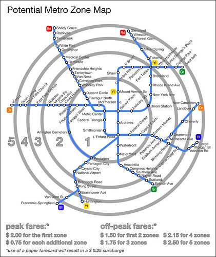
It's official: The NoMa name is coming to Metro. Some are making a big deal about the "new" name, but it's just one more neighborhood name on the Metro map.

An article in today's Washington Post quotes several users of the stop soon-to-be formerly-known as New York Avenue. A few riders don't like the change because they think no one will know where the station is or what the name means.

There may be some initial confusion, but that will pass quickly.

In the debate about renaming this station, there were no easy answers.

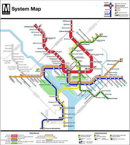
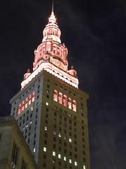
On the one hand, the two streets in the station name, New York Avenue and Florida Avenue were less than optimal because of their length. New York Avenue is over 5 miles long and crosses countless neighborhoods. A tourist looking for the Museum of Women in the Arts at 1250 New York Avenue had better not get off at the New York Avenue station, because they'd be 1.5 miles away from it.

Another reason to shy away from the "New York Avenue" name is that the station of that name is not even the closest station to New York Avenue. A pedestrian would have to walk about 760 feet from the nearest entrance just to reach the street called New York Avenue. Both McPherson Square and Metro Center have entrances that are closer to New York Avenue (the street), and Mount Vernon Square isn't much further away.

But on the other hand, New York Avenue is a well-known street. And the neighborhood does not have well agreed-upon name. NoMa does cover that area, but the newness of the name means many are not familiar with it. So what should the station be called? What could it reasonably be called?

WMATA settled on NoMa-Gallaudet U. Will people be lost and confused with this name? Will we ever get used to this? As one person in the Post put it, many will be confused if they've "been riding Metro your whole life, and now [WMATA] changes a name."

Metro station names often lend their names to the areas where they're located. That's certainly the case with Van Ness. Elsewhere, the stations spread the names of neighborhoods that might otherwise be unknown. Because Woodley Park is on the Metro map, many have heard of it. Glover Park is no less significant on a regional scale, but fewer people know where it is since the train doesn't go there.

Some argue that NoMa is a contrived name. That's certainly the case. But it's no different than other areas in the region. One example springs to mind: Crystal City.

The area in south Arlington is now known as a major office destination. Metro's Blue and Yellow trains and both VRE lines call there. Most people know where Crystal City is, probably because they've seen it on the Metro map or heard it announced by train operators.

But in the early 1960s, Crystal City didn't really have a name. It was a warehouse district next to the railroad tracks. It was a lot like NoMa was two decades ago. But a condominium called Crystal House opened. After that, a few other buildings were built with "Crystal" in their name. Eventually, the area became known as Crystal City, and in 1977 a Metro stop with that name opened.

But let's change history. What if that station had been called "Jefferson Davis Highway" station? What if right now, the Metro Board was debating changing the name share the contrived name of the neighborhood?

Would people be arguing that the new name would confuse tourists? Would some argue that it would be better to use the name of a nearby neighborhood instead? Would others call for retaining the Jefferson Davis name simply out of momentum? Probably.

But in reality, Metro put the Crystal City name on the station. And now, virtually everyone in the region finds it acceptable and knows where it is.

In 20 years, (assuming the station name doesn't change again) NoMa will have even greater name-recognition than it does today. And no one will worry that visitors to the region will get lost because of the name. After all, for most out of towners, NoMa means as little to them as New York Avenue does.

The new station name is more accurate and more concise than the one that has graced the station since 2004. It's not perfect, but it's an improvement.

Monday, September 12, 2011

Keep Following Along

I've been blogging a lot less lately, mainly due to the time commitment I have over at Greater Greater Washington. I'm still trying to find the time to blog here, though.

I've started a Tumblr account. I mainly use it to post some of my favorite photos. You can follow me on Tumblr (or subscribe using RSS).

My Tumblr photos:

Monday, June 13, 2011

A Modern Ruin

Last weekend, I traveled up to Buffalo to tour Buffalo Central Terminal.

Deco Tower

This beautiful Art Deco landmark has been abandoned since 1979, and the 1990s were especially hard on her. But locals have been working to restore the Terminal, and give tours a few times each year.

12:48

It's great that the Central Terminal Restoration Corporation has managed to preserve the station for future generations, but the plight of the terminal symbolizes a difficult issue with respect to preservation. Repurposing a building like this is never easy, and it's especially challenging in a city like Buffalo, where the problems of the Rust Belt are acute and widespread.

Great Hall

The Terminal was built at a time when Buffalo was one of the largest cities in the United States, and a major rail hub. Today, the city has no shortage of office space, and the neighborhood around the station is blighted with abandoned structures and vacant lots. Only a few Amtrak trains call at Buffalo's two stations.

Union News

It will not be easy to convert this space into something else. Train traffic alone doesn't generate enough of a need to reopen the space. Cincinnati has had great success in converting their old station into a museum center. Other potential uses include condos or offices, but as yet, there's been no catalyst to spark a change.

Sunflare/Halo

Some believe that the proposed New York high-speed rail program could be the thing that restarts Central Terminal. But I fear that doesn't make too much sense, either. Central Terminal is not located downtown, nor is it in the best neighborhood. Perhaps linking the Terminal to downtown with light rail would make the old structure more viable, but I think it's still a long shot.

I hope that Buffalo is able to reuse the building somehow. It would be a shame to let this magnificent structure go to waste. But it's clear that the Central Terminal Restoration Corporation has a hard row to hoe.

Thursday, May 26, 2011

A New Look at the Metro Map (Part 2)

In Part 1 of this post, I discussed my entry in Greater Greater Washington's Metro Map Contest.

My earlier post talked about the rules of the contest and my goals for the redesign. Now, I'll discuss some of my design decisions.


Laying the Groundwork:
I chose to keep certain elements. The Potomac and Anacostia Rivers provide needed geographic context, as does the National Mall. I also retained Wyman's icons representing the Capitol, Washington Monument, Lincoln and Jefferson Memorials, and the White House.

The scale of my map is similar to Wyman's. Per the contest requirements, the resolution of the map is the same as those that appear in railcars. On my map, the "square" that represents the boundary of the District of Columbia and Arlington County is the exact same size as the one on Wyman's map.

Lining Up:
Once I'd laid out the basic geography of the map, I started adding rail lines. These lines are by necessity thinner than those on Wyman's map. This is due to the addition of the Silver Line through central Washington.

As far as the lines were concerned, I tried to strike a balance between the layout of Wyman's map and actual geography. That mainly meant changes to the outer ends of the Green Line. North of Fort Totten, for instance, the Green Line is basically running east-west, though Wyman's map shows that as a 45 degree angle.

I also turned the Columbia Heights "corner" into a smoother curve. Doing that allowed the map labels to be placed more logically and gave the Mid-City subway a less severe set of curves.

Dotting the Is:
With the lines laid out, stations came next. But I struggled a bit with creating an icon.

I first tried keeping a single dot per station, as is the case with the current map. But there was no way to create an attractive dot that would work both where 3 lines ran concurrently and where a single line ran alone.

I discounted using dots of different sizes because I wanted the map to be consistent. Use of ovals and rectangles seemed too crude for the map design I sought. And using London-style hatches wouldn't work with the dual Red Line.

Stumped, I turned to Mark Ovenden's book, Transit Maps of the World. Leafing through, I hit upon Amsterdam's map as having the solution. For my map, I used what I call "linked dots" for most stations. I kept Wyman's "target" symbol for the perpendicular transfer stations.

To indicate terminal stations, I filled the station dot with the color of the service that terminates there. I hope that this calls the eye to those stations.

Crossing the Ts:
With lines and stations drawn, it came time for labels. For this task, only one font would do: Helvetica.

Aside from the fact that I'm a huge Helvetica fan, it's the font used throughout the system in signage. It's even the font used in the Metro logo.

With that decision made, the question of placement arose. I was determined to eliminate the text/line overlap that proliferates on the current map. That meant, in some cases, making changes to lines. But it also meant rethinking the way station names are handled.

To counter the "name sprawl" of station monikers, I broke up the longer names into a primary name and a subtitle. This makes it a lot easier to fit names onto the map. Ideally, though, Metro would just shorten the names.

End of the Line:
In order to better accentuate terminal stations, I bolded those station names. I also colored in the "dot" representing the station.

For stations where trains turn short frequently, I decided to go a step further. At those locations, I actually pulled a "spur" off of the mainline. Michael Sypolt (@TransitGuru) told me it reminded him of a train pulling into a pocket track, which is what happens at these locations. I did this to accentuate that some trains stop and go no further.

Doubling Up:
Because the Red Line is operationally two lines, I chose to show it that way.

This allowed me to easily show that off-peak, Silver Spring - Grosvenor trains are extended to Shady Grove. It also would hint that frequencies are higher, though that is not clear from the map alone. And it further accentuates the terminal problem.

Connecting the Dots:
One of the last elements I added to the map were "connection" icons.

I chose to use a standard type of icon to show connections to Amtrak, MARC, and VRE. Those services are shown using a colored circle with an A, M, or V as appropriate. They're "chained" together and to the station where the connection can be made.

This seems to be superior to the current practice of putting the Amtrak, MARC, and VRE logos right on the map haphazardly.

I replaced the generic hatchback that Wyman designed with the universal "P"-in-blue-circle to indicate stations with parking.

To show airport connections, I used an airplane in a yellow circle, with the airport code below. I put that next to a bus or train as appropriate to indicate the connection. In the legend, these connections are further described.

I'd appreciate your feedback on the map. In the future, I hope to continue to build upon it and improve it.

A New Look at the Metro Map (Part 1)

Back in March, I had the idea to have a map contest to redesign the Metro map, which WMATA is doing for a variety of reasons.

David Alpert, Eric Fidler, and I put together the contest, and we got a bunch of great entries. This week, Greater Greater Washington is announcing the winners of the contest (part 1, part 2).

As I mentioned last week, I also entered the contest. I had a lot of fun rethinking the map, and I thought I'd discuss some of my design decisions. My entry, Map L, is below:

MetroMapContestEntry_MJohnson


Remaking something that has been iconic for over 3 decades is a daunting task. But Lance Wyman's 1976 map is in need of replacement. In Part 2, I'll discuss some of the design decisions I made. First, though, I need to discuss the rules of the contest and my goals for the map.

Contest Requirements:
While the goal of the contest was really to generate some "blank slate" looks at the Metro map, it wasn't a complete start-from-scratch contest. The contest imposed several design constraints:
  1. The basic line colors must remain the same.
  2. The Silver Line Phase I & II should be shown as a future line.
  3. Maps should show the Franconia - Greenbelt peak hour service (starts Spring 2012).
  4. Maps should show the West Falls Church - Largo peak hour service (starts Spring 2012).
  5. Stations must retain their current (full) names.
  6. An out-of-system between the Farragut stations should be shown.
  7. The map should be designed to fit in a Metro map case.
My Goals:
I'm fond of Lance Wyman's iconic map. I think it's probably one of the most recognized subway maps in the world, and it has stood the test of time well. At the same time, Metro has outgrown the original map, and experience shows that it falls short in some places.

Don't fix what ain't broke:
Some of the map works well. I wanted to flesh out the parts of the map that I liked most and keep them. Those elements include the basic geography and the landmark icons created by Wyman.

Terminal vistas:
I've pointed out before that Metro's map does nothing to call attention to terminal stations, and that can create problems.

The Red Line is particularly egregious in this regard. For the majority of the day, for instance, every other Red Line train terminates at Silver Spring, 3 stops before the eastern end of the line at Glenmont. Someone on the platform at Dupont Circle who wants to travel to Union Station can take any train from the eastbound platform.

But signs tell riders that trains on that platform go to Glenmont. So when the Silver Spring train shows up, out-of-towners frequently pass on boarding, because they don't know it's headed to the right place. Sometimes they consult the map quickly to decide, but Silver Spring's name is in the same font weight, size, and color as every other station name.

So, off the bat, dealing with terminals better was a primary goal.

Name sprawl/and length-plus suffixes/that are too long:
Fitting Metro's station names onto signs is hard enough, now that WMATA feels the need to add any landmark and/or neighborhood remotely close to a station to the name.

I've also always been irritated that station names overlap rail lines. But with their length, what can be done?

I had some ideas in this regard, and cleaning up station names became another big goal.

Iconography and universality:
Universality is an important aspect of mapping. I feel that Wyman's map lacks that in iconography. From the "boxy Volvo" to the disparate logos indicating transfers to commuter and Amtrak trains, things just seem haphazard.

I also wanted to think of a better way to indicate airport connections. Metro's map uses a bus icon to indicate a plane connection, which just seems odd. It also fails to show a connection to BWI Airport via MARC/Amtrak from New Carrollton and Union Station.

With those ideas in mind, I set out to makeover the Metro map. It was a lot harder than I thought it would be, but I had a lot of fun doing it. I'll discuss that effort in part 2.

Tuesday, May 24, 2011

A Museum on the Rails

Amtrak is celebrating it's 40th year this year, and they've done something very innovative: they've created a rolling museum.

The 40th Anniversary Museum Train debuted at National Train Day in Washington on May 7, and over the next 12 months, it will be cruising the rails around the country.

I didn't feel like I had the chance to appreciate the exhibits on National Train Day due to the crowds and the fact that I was in a little rush. So, I was excited to hear that it would be in Baltimore this past weekend. On Saturday, I hopped the train and took a trip up to Penn Station to see it again.

There were no throngs of people, and so I was able to get ample time with the displays, and plenty of pictures.


I highly recommend you see the train if you get a chance. It will be touring the nation, and you can find the schedule here.

Thursday, May 19, 2011

(Re)Mapping Metro

I have a passion for mapping. And as a result, my first instinct when I heard that Washington's Metro would be redesigning their iconic 1976 map was to make my own attempt at a redesign.

The next thought I had, though, was even better. Why not hold a contest to generate a bunch of entries? So I approached David Alpert at Greater Greater Washington about putting one together. And with his help, along with that of Eric Fidler, we built an interface and put together a jury.

I, of course, put together a map. And I hope it wins, but I'll understand if it doesn't. There is a lot of great competition in the contest. I'm glad so many talented mapmakers chose to enter.

But the voting is in your hands! You have until 11:59 tomorrow to vote for the entries you think are best.

There are 17 entries, and you can vote for as many or as few as you like. You rank them, and GGW will use instant runoff voting to determine the winner. The jury will also be selecting a winner.

GGW will announce the winner next week (and I'll reveal which map is mine at that time, as well).

I hope you will all go vote in the contest.

Collage at top by David Alpert (cc).

Monday, April 18, 2011

Monday Shot: Ready for the Morning

Monday Shot isn't quite espresso, but hopefully this weekly transit picture will help get your week started.

Ready for the Morning
Northeast Regional trains parked at Richmond-Staples Mill Road.


I went down to Florida last week for a vacation and, to quote Johnny Cash, "get some sand in my shoes". And while I couldn't take the Orange Blossom Special, I did manage the Silver Meteor.

I snapped this shot at Richmond's Staples Mill Road station. Since some Northeast Regional trains now start their northbound trips at Richmond, they're kept here overnight.

My photostream

Thursday, April 7, 2011

(Part of a) Mission Accomplished

Those of you who read Track Twenty-Nine know that it's my goal to ride every rail transit system in America.

I've been slowly checking them off my list, and last week, I accomplished a part of the larger mission. Last Monday, when I stepped onto a Cleveland Red Line train at Hopkins Airport, I completed the task of riding every heavy rail system in America - all 13 of them.

Short Turning

Looking back, 13 seems like such a small number. But the systems, of course, are scattered widely across the country.

My trip to Cleveland and St. Louis also netted me two more light rail systems. That means I'm painfully close to completing the "big three" - heavy rail, light rail, and commuter rail.

I only have 5 light rail systems left to ride - Buffalo, Denver, Houston Phoenix, and Salt Lake City. Norfolk is planning to open their Tide LRT this year, though a concrete date has not been set.

In the commuter rail category, I have only 4 systems left - Albuquerque, Austin, Minneapolis, and Salt Lake City. In Texas, the Denton-Dallas "A-Train" commuter rail is also scheduled to open this year.

Wednesday, April 6, 2011

Gateway Pictures

I haven't had a chance to write about my trip to St. Louis, yet. I hope to do that soon. In the meantime, enjoy some of the pictures I took there.

3012 to Fairview
Eastbound MetroLink at East Riverfront.

Missouri Sky
Union Station.

Glass Ripples
Old Courthouse, Downtown buildings.

All Lined Up
Old Courthouse, Gateway Arch.

Bathed in Spotlights
Gateway Arch

Disagreeing With Yourself

Last week, Greater Greater Washington published a post that I coauthored with Michael Perkins exploring the idea of a zone-based fare system for the Washington Metro.

Potential Metro Zone Structure

And since it's publication, I've found myself in an interesting predicament: defending an idea with which I disagree.

Neither Michael or I think that the changeover from graduated fares to a zone-based system is feasible or ideal, but in the past, many GGW commenters had called for just that.

But how do you argue in a concrete way against something that doesn't exist?

Michael and I decided to create a hypothetical fare-zone system for Metro to show people how such a system could work. We decided that if any of this were to be taken seriously, certain criteria would need to be met.

For starters, a zone system couldn't result in a net loss of revenue for Metro. So we made every effort to make our proposal revenue neutral for the agency. In order to do that, we had to get data on fare payment methods from Metro (we already had point-to-point ridership data).

Additionally, we couldn't raise fares above Metro's current fare cap (which is $5.45). We also tried to keep lower-end fares as low as possible in order to encourage equity.

Michael built a mathematical model to measure the revenue implications of different alternatives. Together we worked out where the zone breaks would be, mainly basing it on the existing "composite distance", but sometimes shifting stations where it made logical sense.

After we came up with an alternative we thought was feasible, I created a map.

We then composed a post discussing the advantages and drawbacks of a zone fare system, coming down in the end against it. Rehashing our thoughts on the matter, though, is not the point of this post.

The real impetus is the comment thread that came after our post. Michael and I found ourselves being forced to defend our zone system more than discuss it on the merits. The difficult part is that neither of us support it.

I had hoped that the discussion would have centered on things like equity, complexity, and readability. But more often than not, it seemed like people were just arguing about where the boundaries should be located, how many zones there should be, and what we should charge for it.

After a few hours of defending the zone system I helped design, I got a little short with the commenters, resulting in accusations that our analysis was essentially designed to fail, which was not the case.

From "movement":

So let's take an idea we think is a bad idea, then present an idiotic implementation which proves that it is a bad idea. Come on. You're not even trying!

For those of you following along at home, "movement's" proposal is to make the fare zone boundaries (1) DC, (2) Inside the Beltway, and (3) Everywhere else. Which of course would mean a trip from Shady Grove to Grosvenor would end up costing less than a trip from Silver Spring one stop to Takoma. (And a 2-stop trip from Forest Glen to Takoma would be even more expensive).

At any rate, I was disappointed at the conversation that resulted from this thought experiment. Not all the replies were bad, in fact, some were quite insightful. But by and large, I feel like most people completely missed the point. For example (from Brian Cloverdale):

Let's fix something that isn't broke.

Thanks so much fellows. You've just increased my fares astronomically while no doubt savings bundles for yourself.

When should I pay $2.75 to go from Eastern Market to Dupont Circle and the same $2.75 to go from Eastern Market to Capitol South??????????????

Exactly. Brian hits upon why both Michael and I think zones are inferior to graduated fare systems. But he clearly thinks we're making a serious attempt to change it to zones, instead of trying to inform our argument about why not to change to zones.

In the end, while I enjoyed working on the post, I'm not sure that our post (or the fare zone model) moved the conversation forward. And that's a bit of a disappointment.

Thursday, March 31, 2011

Oh Hi, Ohio

Night SpireLast week, I had the opportunity to spend a full day in Cleveland, Ohio. And I have to admit that I was pleasantly surprised. As it turns out, Cleveland is a pretty nice place.

I'd only ever passed through Cleveland on Amtrak's Capitol Limited in the middle of the night. So I was unsure of what to expect, but my perceptions certainly focused on Cleveland as a rust belt city with some pretty serious environmental problems.

What I found was a city (and a region) facing a severe economic crisis, but one whose downtown and core neighborhoods cling to vibrancy. I was impressed with the urban form of Downtown, a district which has seen better days, but whose architecture and streetscape has fared better than many other cities I've visited.

My trip was short, constrained by the amount of time I had off and the exigencies of cheap airfare. I only had time to visit a few neighborhoods: Shaker Square, Larchmere, Ohio City, the Flats, the Warehouse District, and Downtown.

The first neighborhood I explored was Shaker Square. The neighborhood is centered on the Shaker Square shopping center, the second planned shopping center in the United States. The center comprises four buildings fronting directly onto the square. A light rail line cuts the square in half with its east-west axis. Within the square is a green space.

"Shaker Shops"

The surrounding neighborhood was built as a planned streetcar suburb. The immediate vicinity is characterized by low- and mid-rise apartment buildings, which helps to build transit ridership and places residents within walking distance of the shops.

But the density falls off rapidly as one walks away from the transit station. Within a block or so, are beautiful single-family and two-family homes on tree-lined streets. If I were to live in Cleveland, this would definitely be a place I'd consider.

Larchmere Street


After seeing Shaker Square and a little of Larchmere, I headed for Ohio City. Just across the Cuyahoga River from Downtown, Ohio City is home to the spectacular West Side Market. Unfortunately, I got there a few minutes after the market closed, so I wasn't able to see the inside. But just seeing the exterior of the building was worth the trip.

"Market Stack" Ohio City is one of Cleveland's older neighborhoods. It didn't appear to be in quite as good condition as Shaker Square, but had plenty of activity and a good street wall along the major arteries. I wish I'd had more time to explore, but with the clock ticking, I decided to head for the Flats.

Named for their position on the banks of the Cuyahoga River, the Flats lie below the bluffs where Downtown and Ohio City are located. The lack of easily accessible bridges over the river made it impossible for me to get over to the west bank, which looked to have more going on. As it was, the east bank was almost deserted. I enjoyed the views (and photo opportunities) of the river and high bridges, but with no streetlife, I decided to head back up the bluff to the Warehouse District.

"Warehouse District"

Since the 1990s, the Warehouse District has become the new entertainment district, supplanting the Flats. Perhaps the district is livelier on weekends; it certainly doesn't have the crowds that Washington's Gallery Place has. But there were plenty of loft-dwellers out and about. I stopped for a cup of coffee before continuing my exploration.

Washington doesn't have an analogue to the Warehouse District because it was never an industrial city, as Cleveland was in the 1900s. The district's old building stock has made for great reuse as apartments and entertainment venues.

I headed for the lakefront, but I was stymied by the lack of clear paths down the bluff. My line of sight was blocked by an elevated freeway, and even if I'd tried, walking down West 9th Street, I would have landed literally in the middle of nowhere, as the area hasn't redeveloped yet. Construction of the new convention center blocked other paths farther east. By the time I reached East 9th Street, which would have taken me down to the lakefront, I was ready to head back toward the center of Downtown.

"Eriefront"

If I could change one thing in Downtown Cleveland, I would make it easier for people to access the lakefront. Downtown Cleveland seems more disconnected from its waterfront than any city I can remember visiting.

As I headed back to my hotel, I discovered elements of the City Beautiful movement. The Civic Center area of Downtown is built around a mall and is surrounded by government buildings, almost all in the Neoclassical style - major hallmarks of the City Beautiful. The City Beautiful movement underlies the principles of the McMillian Plan, which is responsible for the Washington we know today.

As it turns out, the Cleveland Mall and Civic Center area bear the fingerprints of Daniel Burnham, designer of Washington's Union Station. The Civic Center is a very complete example of the City Beautiful movement, and I was impressed.

Heading over to Public Square, the symbolic heart of Cleveland, I was surprised at the vibrancy of Downtown. Given the state of the economy, I expected Cleveland to have a lot more vacancy downtown. But the major streets had plenty of restaurants and shops. There were even a good deal of pedestrians out after 6pm, generally a pretty dead time for central business districts.

Terminal Dusk

Of particular note was the Euclid Avenue corridor. This is Cleveland's main drag, and it showed. A streetscape/transit project was completed just a few years ago and that made the street feel cared-for. There were lots of clubs and restaurants. Just off Euclid, East 4th Street has been converted to a pedestrians-only area lined with sidewalk cafes. On that Monday night it was proving popular with fans headed to some nearby sporting event.

E 6 St

Farther out Euclid, Playhouse Square offers many opportunities to see a show. In fact, it's the second largest theater complex in the United States (after New York's Lincoln Center).

Back at Public Square, one of Cleveland's most well-known landmarks, Terminal Tower, stands watch over her home. It sits at the hub of the city's transportation network and for many years, was one of the world's tallest buildings. Built in the Beaux-Arts style in 1930, it was not only a skyscraper, but also Cleveland's Union Terminal.

The atrium to the building, which is open to the public, was meant to be the grand foyer to Cleveland for those arriving by train. And in appropriate placement, the doors open out onto Public Square. While the atrium is not as large as the grand halls of stations in Chicago, Washington, or Los Angeles, it is one of the most ornate and breathtaking spaces of all the great train stations I've visited. It's a real shame that no trains (except for rapid transit) call here.

Cleveland is truly a city of hidden gems. One day is not nearly enough time to devote to this great city. I wish I'd had more time, but I suppose it just gives me an excuse to go back. If you ever have the chance to visit Cleveland, I highly recommend it.

Tuesday, March 29, 2011

Cleveland Rocks

Last week, I had the opportunity to spend a day in Cleveland and I saw as much of the city as I could.

I'll write more about it later, but I thought I'd post a few of my favorite pictures from the adventure.

City Vista

Cleveland Union Terminal

Under Bridge

Track 10 West

Hamilton Sits


You can view all my Cleveland pictures at Flickr.

Friday, February 11, 2011

Photo Friday: Skylit

Photo Friday is a series showcasing a favorite photo of mine. Enjoy!

Skylit
Sunset behind the College Park
Metro station, enhanced by HDR.


My photostream

Monday, February 7, 2011

Monday Shot: 3rd Street

Monday Shot isn't quite espresso, but hopefully this weekly transit picture will help get your week started.

Lynx 3rd Street
The 3rd Street/Convention Center stop on Charlotte's Lynx Light Rail.


I had the pleasure of traveling to Charlotte last week for a zoning reform workshop. Taking the train down from Washington put me over 10,000 lifetime miles on Amtrak.

This shot is an HDR image taken from the northbound platform. It combines 5 shots of different exposure values to make a complex final product.