Thursday, May 26, 2011

A New Look at the Metro Map (Part 2)

In Part 1 of this post, I discussed my entry in Greater Greater Washington's Metro Map Contest.

My earlier post talked about the rules of the contest and my goals for the redesign. Now, I'll discuss some of my design decisions.


Laying the Groundwork:
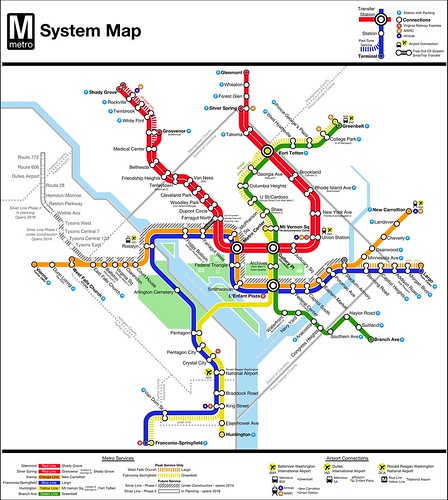
I chose to keep certain elements. The Potomac and Anacostia Rivers provide needed geographic context, as does the National Mall. I also retained Wyman's icons representing the Capitol, Washington Monument, Lincoln and Jefferson Memorials, and the White House.

The scale of my map is similar to Wyman's. Per the contest requirements, the resolution of the map is the same as those that appear in railcars. On my map, the "square" that represents the boundary of the District of Columbia and Arlington County is the exact same size as the one on Wyman's map.

Lining Up:
Once I'd laid out the basic geography of the map, I started adding rail lines. These lines are by necessity thinner than those on Wyman's map. This is due to the addition of the Silver Line through central Washington.

As far as the lines were concerned, I tried to strike a balance between the layout of Wyman's map and actual geography. That mainly meant changes to the outer ends of the Green Line. North of Fort Totten, for instance, the Green Line is basically running east-west, though Wyman's map shows that as a 45 degree angle.

I also turned the Columbia Heights "corner" into a smoother curve. Doing that allowed the map labels to be placed more logically and gave the Mid-City subway a less severe set of curves.

Dotting the Is:
With the lines laid out, stations came next. But I struggled a bit with creating an icon.

I first tried keeping a single dot per station, as is the case with the current map. But there was no way to create an attractive dot that would work both where 3 lines ran concurrently and where a single line ran alone.

I discounted using dots of different sizes because I wanted the map to be consistent. Use of ovals and rectangles seemed too crude for the map design I sought. And using London-style hatches wouldn't work with the dual Red Line.

Stumped, I turned to Mark Ovenden's book, Transit Maps of the World. Leafing through, I hit upon Amsterdam's map as having the solution. For my map, I used what I call "linked dots" for most stations. I kept Wyman's "target" symbol for the perpendicular transfer stations.

To indicate terminal stations, I filled the station dot with the color of the service that terminates there. I hope that this calls the eye to those stations.

Crossing the Ts:
With lines and stations drawn, it came time for labels. For this task, only one font would do: Helvetica.

Aside from the fact that I'm a huge Helvetica fan, it's the font used throughout the system in signage. It's even the font used in the Metro logo.

With that decision made, the question of placement arose. I was determined to eliminate the text/line overlap that proliferates on the current map. That meant, in some cases, making changes to lines. But it also meant rethinking the way station names are handled.

To counter the "name sprawl" of station monikers, I broke up the longer names into a primary name and a subtitle. This makes it a lot easier to fit names onto the map. Ideally, though, Metro would just shorten the names.

End of the Line:
In order to better accentuate terminal stations, I bolded those station names. I also colored in the "dot" representing the station.

For stations where trains turn short frequently, I decided to go a step further. At those locations, I actually pulled a "spur" off of the mainline. Michael Sypolt (@TransitGuru) told me it reminded him of a train pulling into a pocket track, which is what happens at these locations. I did this to accentuate that some trains stop and go no further.

Doubling Up:
Because the Red Line is operationally two lines, I chose to show it that way.

This allowed me to easily show that off-peak, Silver Spring - Grosvenor trains are extended to Shady Grove. It also would hint that frequencies are higher, though that is not clear from the map alone. And it further accentuates the terminal problem.

Connecting the Dots:
One of the last elements I added to the map were "connection" icons.

I chose to use a standard type of icon to show connections to Amtrak, MARC, and VRE. Those services are shown using a colored circle with an A, M, or V as appropriate. They're "chained" together and to the station where the connection can be made.

This seems to be superior to the current practice of putting the Amtrak, MARC, and VRE logos right on the map haphazardly.

I replaced the generic hatchback that Wyman designed with the universal "P"-in-blue-circle to indicate stations with parking.

To show airport connections, I used an airplane in a yellow circle, with the airport code below. I put that next to a bus or train as appropriate to indicate the connection. In the legend, these connections are further described.

I'd appreciate your feedback on the map. In the future, I hope to continue to build upon it and improve it.

A New Look at the Metro Map (Part 1)

Back in March, I had the idea to have a map contest to redesign the Metro map, which WMATA is doing for a variety of reasons.

David Alpert, Eric Fidler, and I put together the contest, and we got a bunch of great entries. This week, Greater Greater Washington is announcing the winners of the contest (part 1, part 2).

As I mentioned last week, I also entered the contest. I had a lot of fun rethinking the map, and I thought I'd discuss some of my design decisions. My entry, Map L, is below:

MetroMapContestEntry_MJohnson


Remaking something that has been iconic for over 3 decades is a daunting task. But Lance Wyman's 1976 map is in need of replacement. In Part 2, I'll discuss some of the design decisions I made. First, though, I need to discuss the rules of the contest and my goals for the map.

Contest Requirements:
While the goal of the contest was really to generate some "blank slate" looks at the Metro map, it wasn't a complete start-from-scratch contest. The contest imposed several design constraints:
  1. The basic line colors must remain the same.
  2. The Silver Line Phase I & II should be shown as a future line.
  3. Maps should show the Franconia - Greenbelt peak hour service (starts Spring 2012).
  4. Maps should show the West Falls Church - Largo peak hour service (starts Spring 2012).
  5. Stations must retain their current (full) names.
  6. An out-of-system between the Farragut stations should be shown.
  7. The map should be designed to fit in a Metro map case.
My Goals:
I'm fond of Lance Wyman's iconic map. I think it's probably one of the most recognized subway maps in the world, and it has stood the test of time well. At the same time, Metro has outgrown the original map, and experience shows that it falls short in some places.

Don't fix what ain't broke:
Some of the map works well. I wanted to flesh out the parts of the map that I liked most and keep them. Those elements include the basic geography and the landmark icons created by Wyman.

Terminal vistas:
I've pointed out before that Metro's map does nothing to call attention to terminal stations, and that can create problems.

The Red Line is particularly egregious in this regard. For the majority of the day, for instance, every other Red Line train terminates at Silver Spring, 3 stops before the eastern end of the line at Glenmont. Someone on the platform at Dupont Circle who wants to travel to Union Station can take any train from the eastbound platform.

But signs tell riders that trains on that platform go to Glenmont. So when the Silver Spring train shows up, out-of-towners frequently pass on boarding, because they don't know it's headed to the right place. Sometimes they consult the map quickly to decide, but Silver Spring's name is in the same font weight, size, and color as every other station name.

So, off the bat, dealing with terminals better was a primary goal.

Name sprawl/and length-plus suffixes/that are too long:
Fitting Metro's station names onto signs is hard enough, now that WMATA feels the need to add any landmark and/or neighborhood remotely close to a station to the name.

I've also always been irritated that station names overlap rail lines. But with their length, what can be done?

I had some ideas in this regard, and cleaning up station names became another big goal.

Iconography and universality:
Universality is an important aspect of mapping. I feel that Wyman's map lacks that in iconography. From the "boxy Volvo" to the disparate logos indicating transfers to commuter and Amtrak trains, things just seem haphazard.

I also wanted to think of a better way to indicate airport connections. Metro's map uses a bus icon to indicate a plane connection, which just seems odd. It also fails to show a connection to BWI Airport via MARC/Amtrak from New Carrollton and Union Station.

With those ideas in mind, I set out to makeover the Metro map. It was a lot harder than I thought it would be, but I had a lot of fun doing it. I'll discuss that effort in part 2.

Tuesday, May 24, 2011

A Museum on the Rails

Amtrak is celebrating it's 40th year this year, and they've done something very innovative: they've created a rolling museum.

The 40th Anniversary Museum Train debuted at National Train Day in Washington on May 7, and over the next 12 months, it will be cruising the rails around the country.

I didn't feel like I had the chance to appreciate the exhibits on National Train Day due to the crowds and the fact that I was in a little rush. So, I was excited to hear that it would be in Baltimore this past weekend. On Saturday, I hopped the train and took a trip up to Penn Station to see it again.

There were no throngs of people, and so I was able to get ample time with the displays, and plenty of pictures.


I highly recommend you see the train if you get a chance. It will be touring the nation, and you can find the schedule here.

Thursday, May 19, 2011

(Re)Mapping Metro

I have a passion for mapping. And as a result, my first instinct when I heard that Washington's Metro would be redesigning their iconic 1976 map was to make my own attempt at a redesign.

The next thought I had, though, was even better. Why not hold a contest to generate a bunch of entries? So I approached David Alpert at Greater Greater Washington about putting one together. And with his help, along with that of Eric Fidler, we built an interface and put together a jury.

I, of course, put together a map. And I hope it wins, but I'll understand if it doesn't. There is a lot of great competition in the contest. I'm glad so many talented mapmakers chose to enter.

But the voting is in your hands! You have until 11:59 tomorrow to vote for the entries you think are best.

There are 17 entries, and you can vote for as many or as few as you like. You rank them, and GGW will use instant runoff voting to determine the winner. The jury will also be selecting a winner.

GGW will announce the winner next week (and I'll reveal which map is mine at that time, as well).

I hope you will all go vote in the contest.

Collage at top by David Alpert (cc).