David Alpert, Eric Fidler, and I put together the contest, and we got a bunch of great entries. This week, Greater Greater Washington is announcing the winners of the contest (part 1, part 2).
As I mentioned last week, I also entered the contest. I had a lot of fun rethinking the map, and I thought I'd discuss some of my design decisions. My entry, Map L, is below:
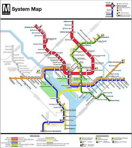
Remaking something that has been iconic for over 3 decades is a daunting task. But Lance Wyman's 1976 map is in need of replacement. In Part 2, I'll discuss some of the design decisions I made. First, though, I need to discuss the rules of the contest and my goals for the map.
Contest Requirements:
While the goal of the contest was really to generate some "blank slate" looks at the Metro map, it wasn't a complete start-from-scratch contest. The contest imposed several design constraints:
- The basic line colors must remain the same.
- The Silver Line Phase I & II should be shown as a future line.
- Maps should show the Franconia - Greenbelt peak hour service (starts Spring 2012).
- Maps should show the West Falls Church - Largo peak hour service (starts Spring 2012).
- Stations must retain their current (full) names.
- An out-of-system between the Farragut stations should be shown.
- The map should be designed to fit in a Metro map case.
I'm fond of Lance Wyman's iconic map. I think it's probably one of the most recognized subway maps in the world, and it has stood the test of time well. At the same time, Metro has outgrown the original map, and experience shows that it falls short in some places.
Don't fix what ain't broke:
Some of the map works well. I wanted to flesh out the parts of the map that I liked most and keep them. Those elements include the basic geography and the landmark icons created by Wyman.
Terminal vistas:
I've pointed out before that Metro's map does nothing to call attention to terminal stations, and that can create problems.
The Red Line is particularly egregious in this regard. For the majority of the day, for instance, every other Red Line train terminates at Silver Spring, 3 stops before the eastern end of the line at Glenmont. Someone on the platform at Dupont Circle who wants to travel to Union Station can take any train from the eastbound platform.
But signs tell riders that trains on that platform go to Glenmont. So when the Silver Spring train shows up, out-of-towners frequently pass on boarding, because they don't know it's headed to the right place. Sometimes they consult the map quickly to decide, but Silver Spring's name is in the same font weight, size, and color as every other station name.
So, off the bat, dealing with terminals better was a primary goal.
Name sprawl/and length-plus suffixes/that are too long:
Fitting Metro's station names onto signs is hard enough, now that WMATA feels the need to add any landmark and/or neighborhood remotely close to a station to the name.
I've also always been irritated that station names overlap rail lines. But with their length, what can be done?
I had some ideas in this regard, and cleaning up station names became another big goal.
Iconography and universality:
Universality is an important aspect of mapping. I feel that Wyman's map lacks that in iconography. From the "boxy Volvo" to the disparate logos indicating transfers to commuter and Amtrak trains, things just seem haphazard.
I also wanted to think of a better way to indicate airport connections. Metro's map uses a bus icon to indicate a plane connection, which just seems odd. It also fails to show a connection to BWI Airport via MARC/Amtrak from New Carrollton and Union Station.
With those ideas in mind, I set out to makeover the Metro map. It was a lot harder than I thought it would be, but I had a lot of fun doing it. I'll discuss that effort in part 2.


2 comments:
Something about your map didn't strike me as being right, hence I didn't vote for it. I think it was your leaving the Beltway off that did it...
Matt, I really like your revised map. In particular, I like:
* the new parking icons
* coloring the dot for the line termini (and bolding the station name)
* I like the use of the transfer station icons only for crossing lines
I do NOT care so much for:
* the hashed line "siding bumpout" indicating the end of the Yellow line run at Fort Totten - looks really cluttered. Not sure how to indicate that, but I might just finisse it and leave it out.
* the out-of-system transfer graphic is too heavy, and might imply a physical tunnel (Metro will clearly have to invest in some in-station signage to make this understandable to anyone besides daily riders using those stations)
* having the Beltway is useful to people who drive to the outer stations.
Great effort, and I hope many of your ideas are picked up in the official revision from Metro.
Post a Comment