In late July, I wrote about passenger flows on the Metro system. Unfortunately, the study had to cope with limitations in the data from Metro. Better data would certainly yield more informative results, we can perhaps glean some more information from the existing data. Some readers asked about breaking down the data to create flow maps for individual stations.
To estimate the ridership on each link of the Metro system, we assigned trips from each origin/destination station pair to a given route based on a survey. While the survey was unscientific, it did give us insight into how Metro riders choose their routes within the system. If we look at a given station, according to Metro's data, we can tell how many passengers are traveling to any other given station. Our model assigns those trips to certain links based on a decision tree created from the survey results. A look at this data won't tell us when the majority of riders are boarding at a given station, but it does tell us where they're going.
Take, for example, Vienna. Based on what we know about the station, it is safe to assume that most riders are boarding in the morning and traveling toward downtown. While it is clear that some of the boardings at Vienna do take place during off-peak periods and in the evening rush, with the data we have, we can't say how many.

The above map shows the passenger flow of boardings at Vienna. Most riders are going to downtown. The majority of passengers have exited by the time their train reaches L'Enfant Plaza. Few transfer to other lines.
A look at the other end of the Orange Line shows a similar trend. In this case, passengers boarding at New Carrollton have mostly alighted by the time their train gets to Farragut West. Only a few continue farther west. Similarly, not very many transfer to other lines.

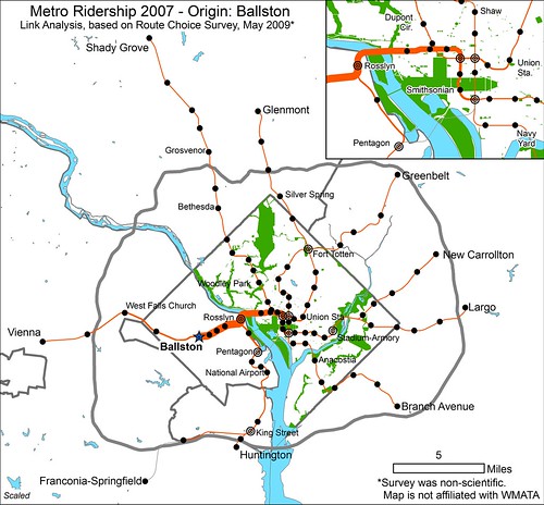
Looking at a station closer to the core, we can see that at Ballston, which has a healthy mix of offices and residential, mostly sees trips toward downtown. Remember that we can't tell when these trips are occurring, but this seems to indicate that people are either commuting from Ballston to downtown (AM) and back (PM) or from downtown to Ballston (AM) and back (PM). It seems more likely that the majority are downtown-bound in the AM. Some trips do head toward Vienna. The links west of Ballston either show people from the suburbs riding from Vienna to Ballston and back (their PM trip being captured here) or Ballstonians commuting to Vienna (AM captured here) and back, although it's actually a combination of both directions of travel.

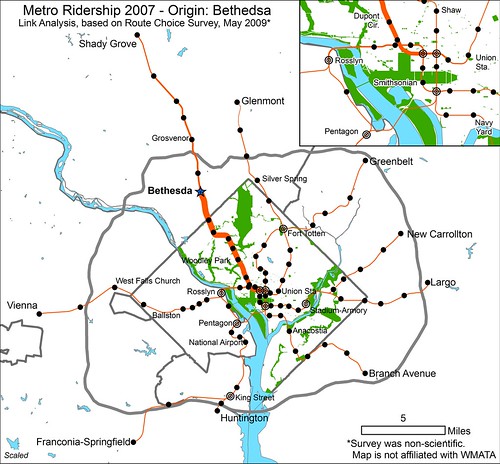
A look at a similar activity center on the Red Line, Bethesda, shows similar results. Most trips whose origin is at Bethesda are headed for downtown. Some passengers do head toward Shady Grove, however. But as before, we cannot be certain of the time of day when these trips are occurring, and therefore cannot tell for certain which the predominant direction of travel is at a given time.

A little farther down the Red Line at Cleveland Park, it appears that most trips are bound for downtown. Other urban stops of a similar nature probably show similar results.

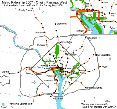
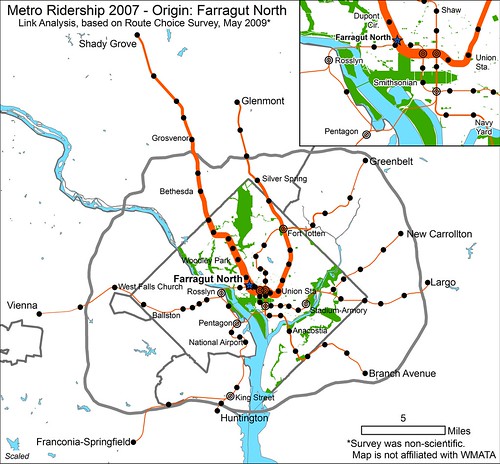
Looking at the central business district yields some interesting results as well. Unsurprisingly, passengers bound from the Farragut Square area to destinations in Montgomery County tend to board at Farragut North while passengers bound for Virginia enter the system at Farragut West. Not as many Farragut West customers are headed toward New Carrollton and Largo as Virginia, but there is some travel to the east. Perhaps the most notable piece of information to be gleaned from these maps revolves around Green Line-bound passengers. While not many passengers bound toward Greenbelt or Branch Avenue board at either of the Farragut twins, most of those who do board at Farragut North.


For some reason there is a preference for the Red Line for passengers headed toward the Green Line. To some degree this could be a habitual behavior remaining from the period 1993-1999 when Green Line trains from Greenbelt shared with the Red Line between Brookland and Farragut North. More likely, however, patrons probably value the Red Line's higher frequency and shorter trip to the nearest Green Line transfer station (Gallery Place). On the other hand, it could just be that more workers are concentrated at Farragut North and those headed for Orange are willing to walk to Farragut West, but Green Line riders don't see the need.
***
*NOTE: All maps are to scale. The thickness of the lines on each map is comparable to the thickness of the lines on all the other maps. The thicker the line, the higher the ridership.
Comments have been disabled. Please comment on this same post at Greater Greater Washington.


